XFX did not begin with a grand mandate to build a global graphics-card brand. It began when Pine Technology asked our small Orange County agency to redesign a website. I looked past the brief, saw one product category I understood as a gamer, and argued that the larger opportunity was to build a focused brand around it.
This is my account of what followed: the decisions, the people who took the risks, the packaging that made the product visible and the mistakes that became easier to see only after the strategy worked. The numbers are drawn from my recollection and the business information available to our team at the time. They are context for the story, not independently audited financial statements.
The assignment was a website. The opportunity was a brand.
In the early 2000s, I was senior creative director at Crisp Digital Brand Agency. We were a small shop whose clients were mostly local businesses. Then Lionel Garcia, Pine Technology’s head of sales, approached us about a new website.
Pine sold an assortment of computer-related products, including MP3 players, optical drives, controller cards and graphics cards. A broad corporate website could have presented all of them more neatly, but neatness was not the same as positioning. I was a gamer, and the graphics card was the part of the business I understood from the inside. I could see both the product’s potential and how little personality most brands in the category expressed.
I recommended concentrating on that category and creating a distinct brand for it. That proposal expanded a web project into naming, identity, packaging, voice and, eventually, a complete market presence. It also required Pine’s president, Eddie Memon, to support a direction that carried real risk. Creative conviction matters, but it does not ship anything without a client willing to act on it.
I looked at the shelf through the eyes of a gamer
The graphics-card shelf was crowded with names, specifications and fantasy imagery. The strongest historical example, in my view, was 3dfx. Its Voodoo packaging used a recurring crop of a face and eyes, creating continuity from one product generation to the next. Even when shoppers did not remember every model, the family resemblance made the boxes recognizable.
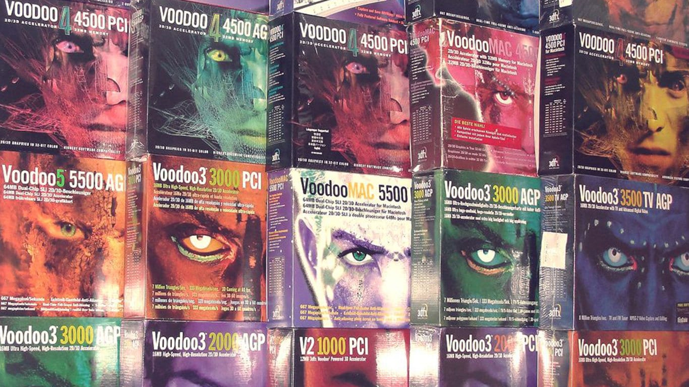
Many competitors used creatures, warriors, machines or metallic objects, but much of the work felt like generic illustration applied to a technology product. My thought was simple: if we were selling hardware that promised better 3D graphics, the packaging itself should demonstrate a more convincing vision of 3D.
I found Me Company, a European studio whose robotic dogs and cats had detailed paneling, chrome reflections and the feeling that they might come off the box. We licensed the characters for roughly $10,000. Against an initial working budget of about $50,000, that was not a casual purchase. It was a concentrated bet on the element most likely to change how the product was perceived.
The name and mark gave the idea a structure
After exploring many names, I landed on XFX, shorthand for “extreme effects.” It was compact, energetic and closely connected to what a graphics card enabled. More importantly, it gave us an idea we could continue to express as the technology improved.
The typography needed careful balance. I made the first X heavier and the following FX slightly lighter so the name would be read as X-F-X rather than collapsing into an unfamiliar word. The icon grew from the way I wrote an x in mathematical notation, surrounded by an orbit-like arc. We rendered the identity with chromatic, three-dimensional surfaces because, at that moment, the treatment reinforced the category rather than decorating it.
A successful identity is not only a logo. The name, mark, characters, surfaces, box structure and writing style began supporting the same promise. Repetition across those elements is what turned a design into a recognizable system.
The first box established the code
Our first launch used a conventional rectangular package for the GeForce4 MX series. The robotic dog or cat occupied the center, while four triangular forms created an X in the negative space around it. The box was still practical to manufacture and stock, but it looked unlike the surrounding products.
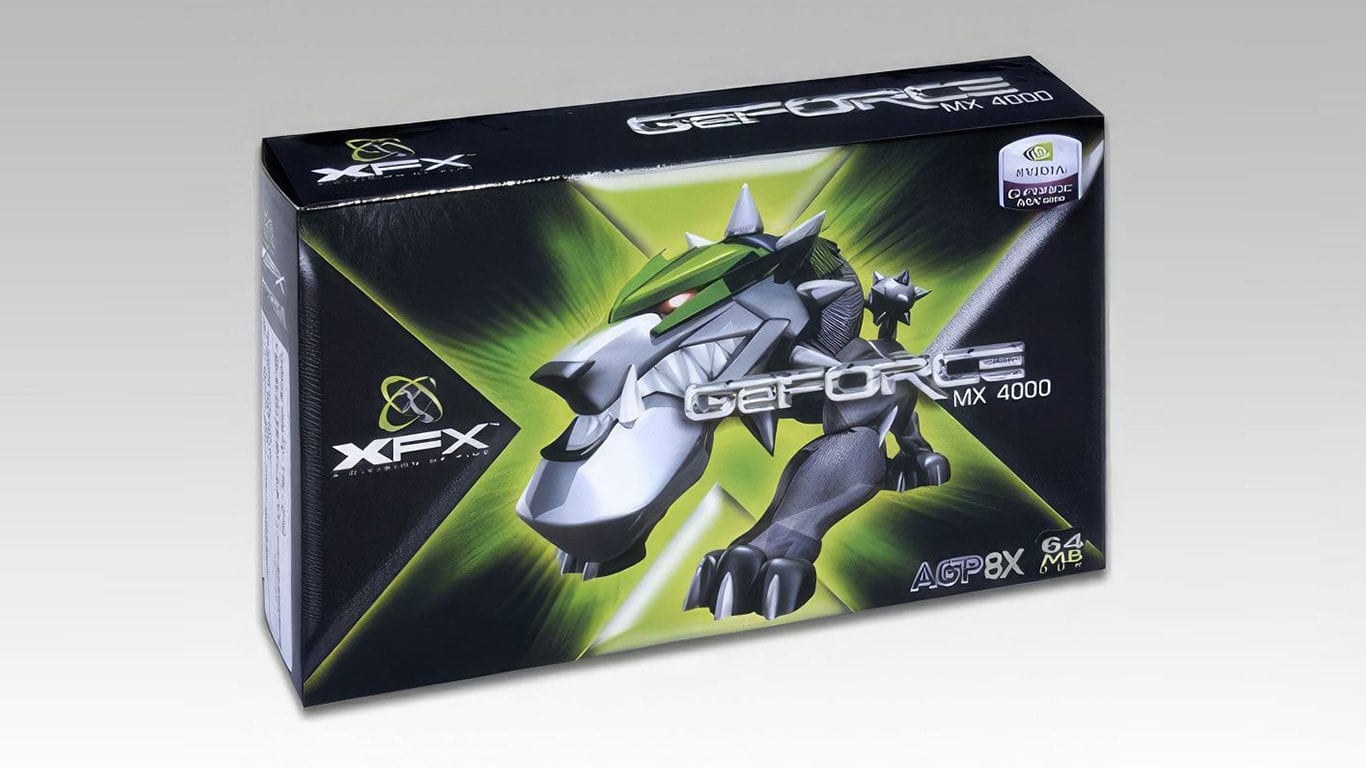
According to the results our team saw, sales grew roughly fourfold in the first year. I would not attribute that outcome to packaging alone. Product, price, distribution, timing, sales relationships and a client willing to invest all mattered. What the packaging did was make the offer easier to notice and remember. It gave those other advantages a visible identity.
Then the package itself became an X
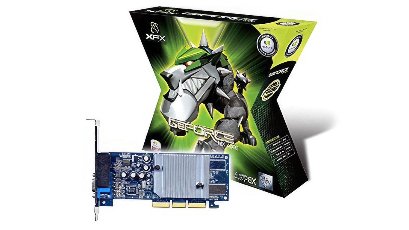
Once the first system proved itself, I proposed something more difficult: an X-shaped box. The idea sounds obvious after the fact, but a retail package is an engineered object. It has to hold the card, protect it, communicate mandatory information, fold efficiently, ship without wasting volume, survive handling and still face the right direction on a store shelf.
We worked through those constraints until the structure could be produced and flattened. The result transformed the most ordinary part of the buying experience—the container—into our most distinctive brand asset. A shopper did not need to read the name before recognizing that the box belonged to XFX.
The useful question was not, “Where can we place the logo?” It was, “What part of this experience could only belong to us?”
A partner’s consistency could not become our sameness
As XFX became a larger NVIDIA partner, NVIDIA introduced tighter rules for badges, copy and other packaging elements. Its objective was understandable: the chip brand needed consistency across many board partners. Our objective was different. If every partner used the same hierarchy and corporate language, the products would become harder to distinguish.
We pushed back where the rules threatened the personality buyers recognized. The writing on our boxes was direct, playful and occasionally provocative. One line ended with “Open a box of whoop ass.” The tagline “Play Hard” carried the same attitude in a form that could last. The point was not to sound reckless for its own sake. It was to sound like people who understood why someone cared about this hardware.
I would describe that approach more carefully today. “Gamers” are not a single personality, and authenticity is not permission to stereotype an audience or ignore legal, retail and platform constraints. The real lesson is to know which requirements protect the ecosystem and which requests would erase the reason customers choose you. Product knowledge gave us grounds to negotiate; attitude alone would not have.
The system expanded from the shelf into an environment
The same codes eventually appeared beyond packaging. Trade-show environments used the X, dark metallic surfaces and “Play Hard” language at architectural scale. That continuity mattered. The brand a distributor encountered in a booth felt like the brand a shopper encountered on a shelf.
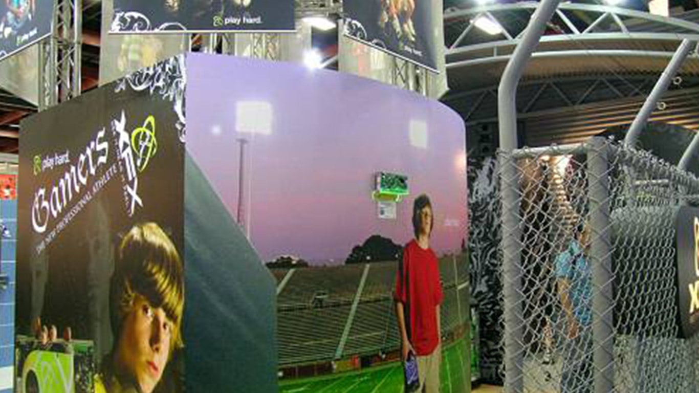
Within roughly five years, the business figures I saw placed XFX around the quarter-billion-dollar level. I played a meaningful creative and strategic role, but I did not build that business alone. Eddie Memon’s sponsorship, Lionel Garcia’s sales leadership, Pine’s manufacturing and distribution capabilities, our agency team and many other people turned the ideas into products customers could actually buy.
Success eventually became its own constraint
The hardest lesson came after the system succeeded. We became dogmatic about robotic characters and unusual X-shaped packaging. We spent heavily creating more complex versions even when the incremental effect was smaller. What began as a sharp response to one moment slowly became a rule we were afraid to break.
That is a common danger in brand building. Teams confuse the expression with the principle. Our principle was to make advanced graphics tangible and give gamers a brand with conviction. The specific characters and package structures were tools. Once the market, technology or retail environment changed, those tools deserved the same scrutiny we had applied to the old conventions.
What I carried forward
| Decision | What worked | What I learned later |
|---|---|---|
| Challenge the website brief | It exposed a larger positioning opportunity. | Expansion is useful only when it connects to a real business advantage. |
| License distinctive 3D characters | A concentrated creative investment made the category promise visible. | A bold asset still depends on product, price, distribution and execution. |
| Turn the package into an X | The physical structure made the brand recognizable before the name was read. | Distinctiveness has to survive manufacturing, shipping and retail constraints. |
| Protect the brand voice | Direct language separated XFX from more corporate competitors. | Relevance comes from knowledge of the audience, not a caricature of it. |
| Repeat successful codes | Consistency connected packaging, messaging and environments. | A brand code should remain a tool, not become a ritual no one can question. |
A brand becomes valuable when the decisions reinforce one another
The memorable part of the XFX story is the strange box, the robotic dog and the rebellious copy. The more important part is the sequence beneath them. We identified one audience we understood, chose one category where the company could focus, invested in a visual idea that made the product promise tangible, engineered it into the buying experience and defended a voice that competitors could not easily borrow.
None of those moves is a formula to repeat literally. A different brand may need restraint instead of aggression, or a service experience instead of distinctive packaging. The transferable lesson is to find the place where strategy, product and expression meet—and make that place unmistakably yours.