CyberPowerPC
Recognition with
room to evolve.
Make the name
mean more.
When I joined CyberPowerPC in 2015, the company had a strong product business. Its identity needed to express where the brand could go next.
I designed the new mark and built a direction that could extend through packaging, products, campaigns, the website, and apparel. Over the following decade, the expression evolved as the business and its audience changed.
01 / A recognizable core
One mark.
Many ways to belong.

A hexagonal structure brings the C and P together. The center becomes a lightning bolt; rounded corners temper the sharpness.
Angled letterforms retain a connection to the earlier identity, while a simpler silhouette gives the brand a more distinctive presence.
I used competitive comparisons and tangible applications to make the new direction familiar. Winning acceptance was part of the design work.
02 / The early system
Identity you
could touch.
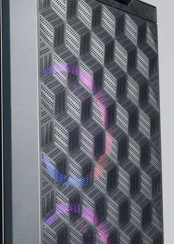
The dotted geometry extended the early identity into packaging and working ventilation. That required collaboration on scale, stamping, alignment, and airflow.
The pattern served the brand for about five years before it was retired. Its importance was in opening up new ways to apply the identity to the product itself.
A considered detail
The person first.
The brand, remembered.
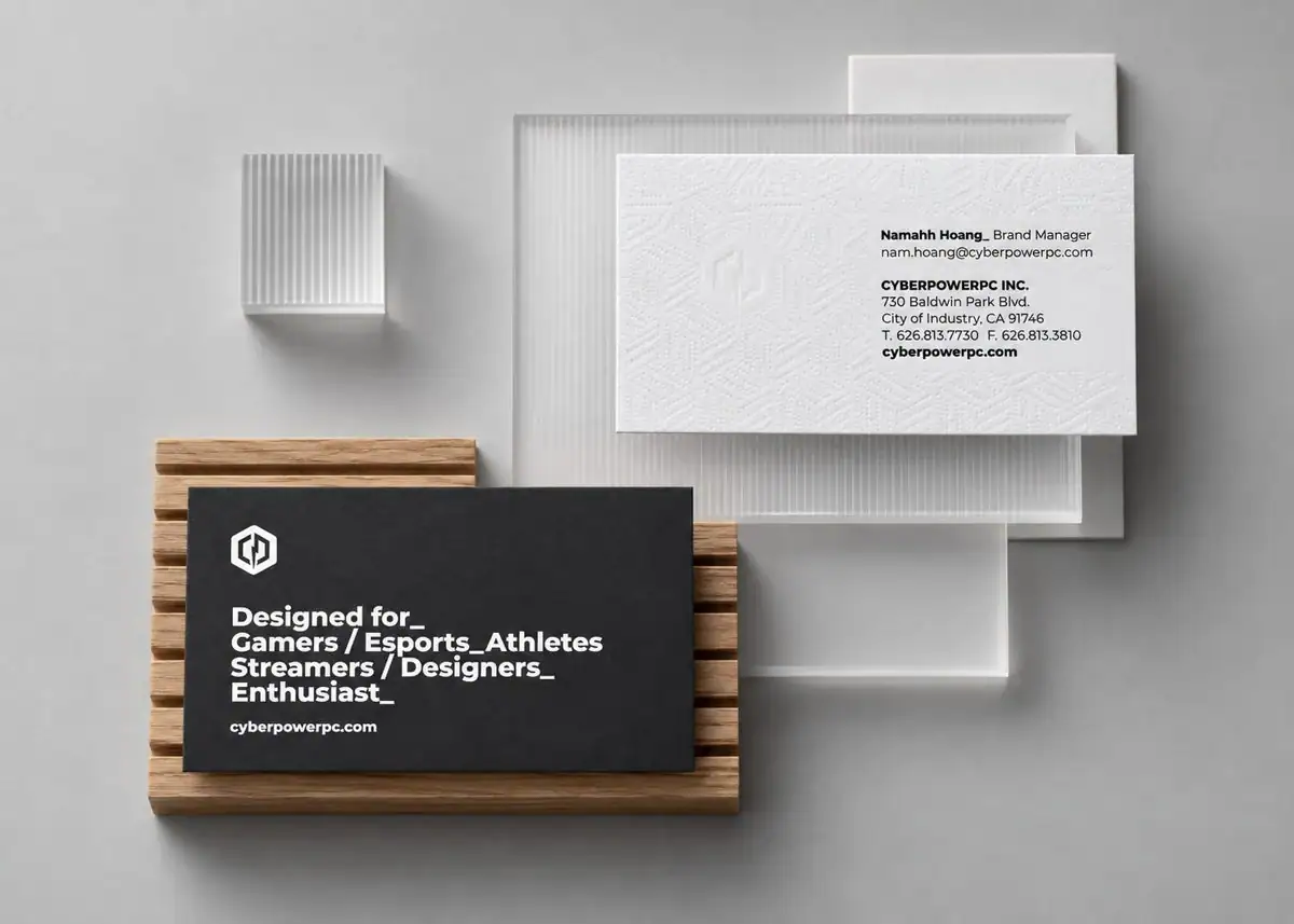
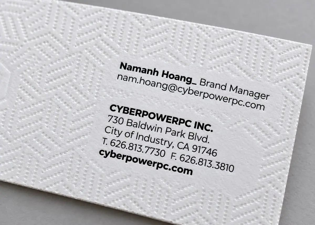
The white face gives the name a clear place to sit. The reverse names the people the brand serves: gamers, esports athletes, streamers, designers, and enthusiasts.
It is a small object, with the same attention to hierarchy and physical finish.
03 / Cultural expression
Give recognition
some range.
As the category converged on restrained technology imagery, I pushed our marketing toward saturated color, assertive typography, and a rougher visual language.
Hypercolor and brutalist influences gave the work energy. Later, I tightened the direction so a growing team could maintain it consistently. The expression changed; the identity remained recognizable.
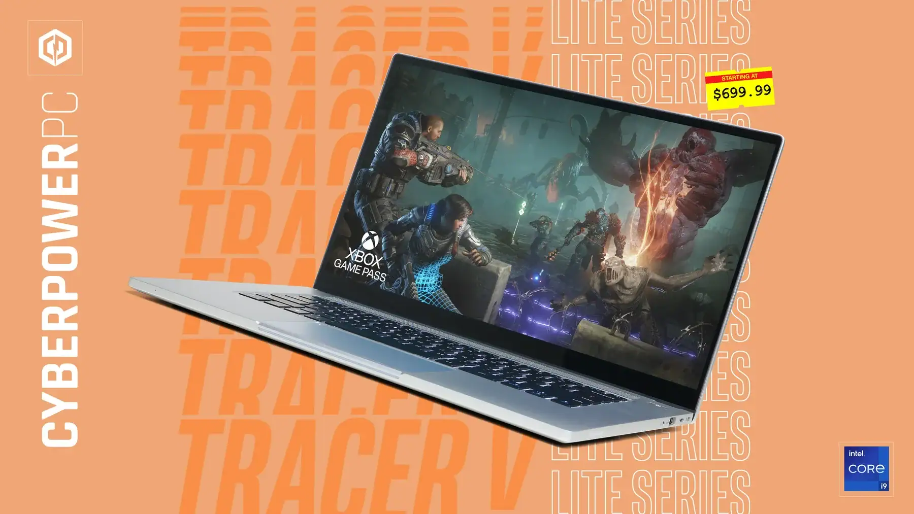
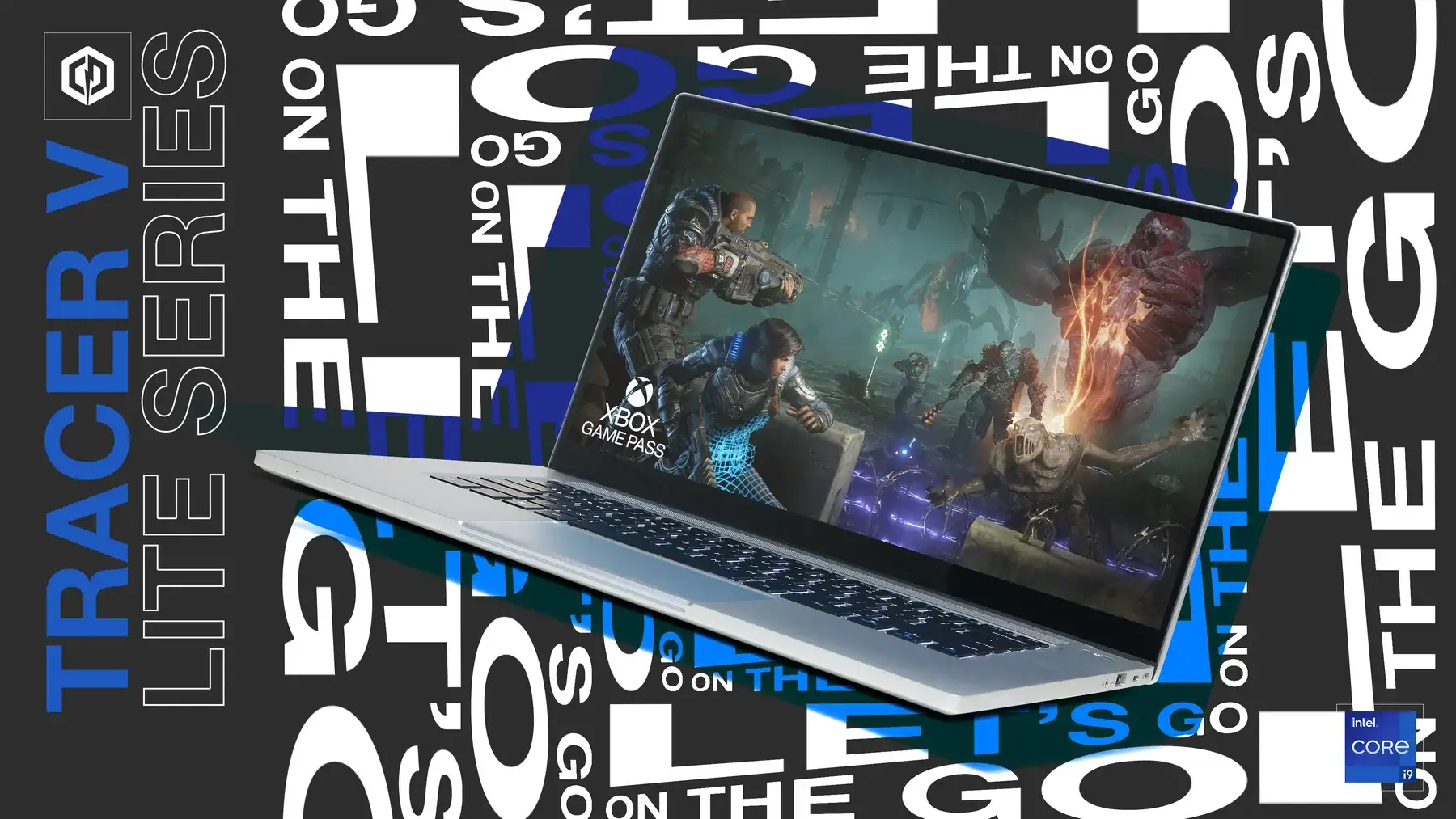
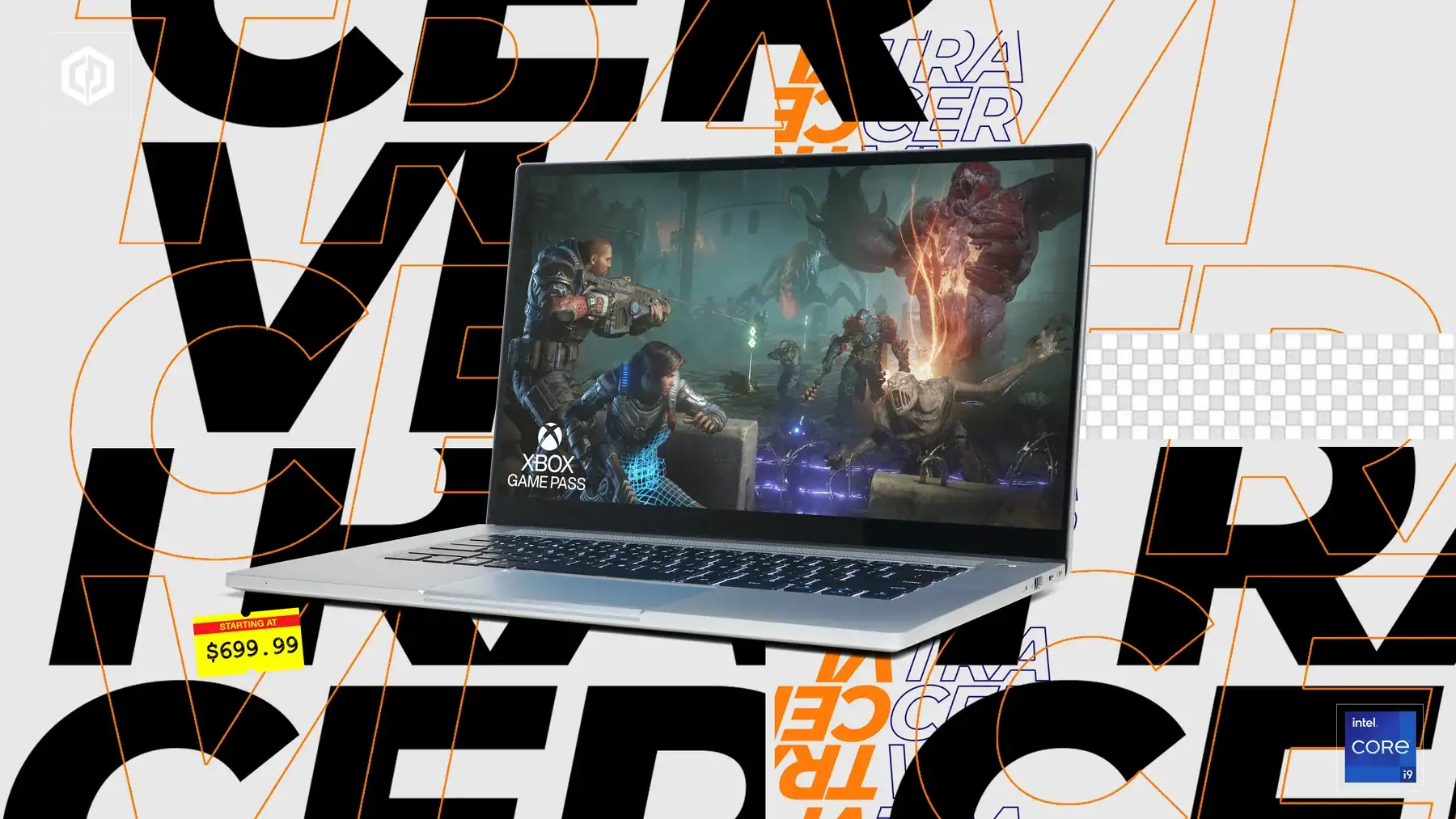
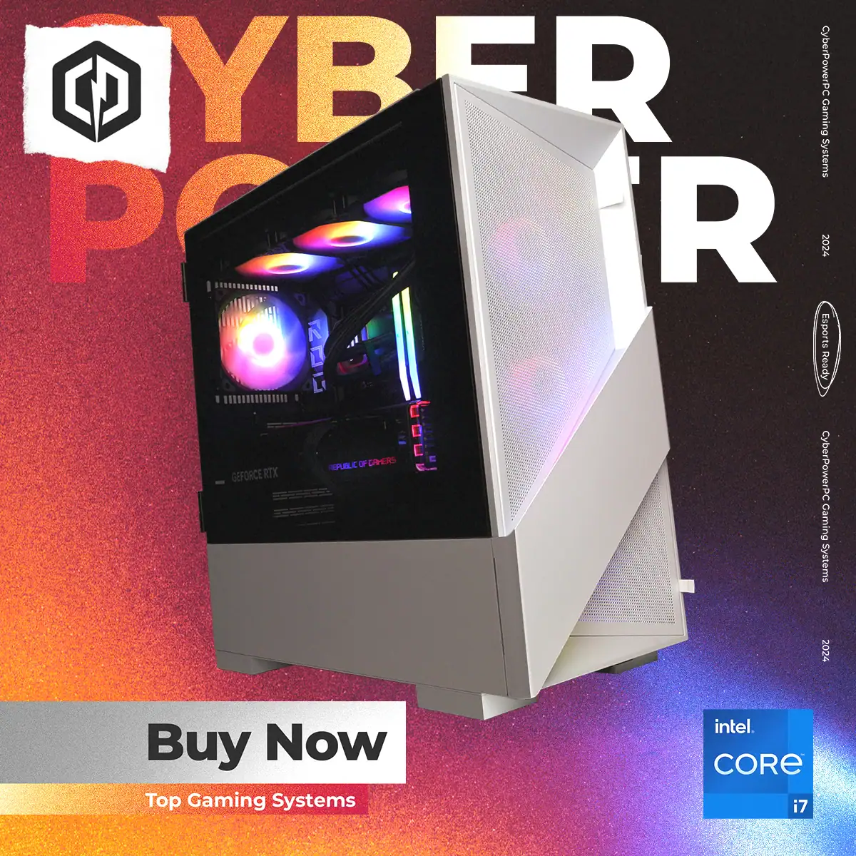
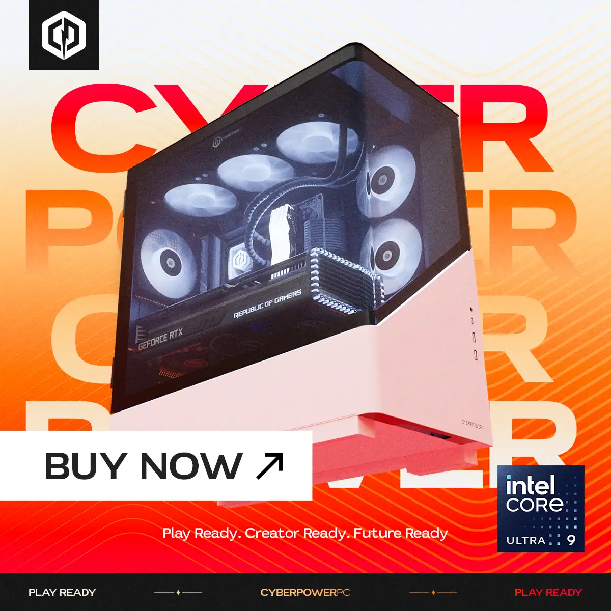
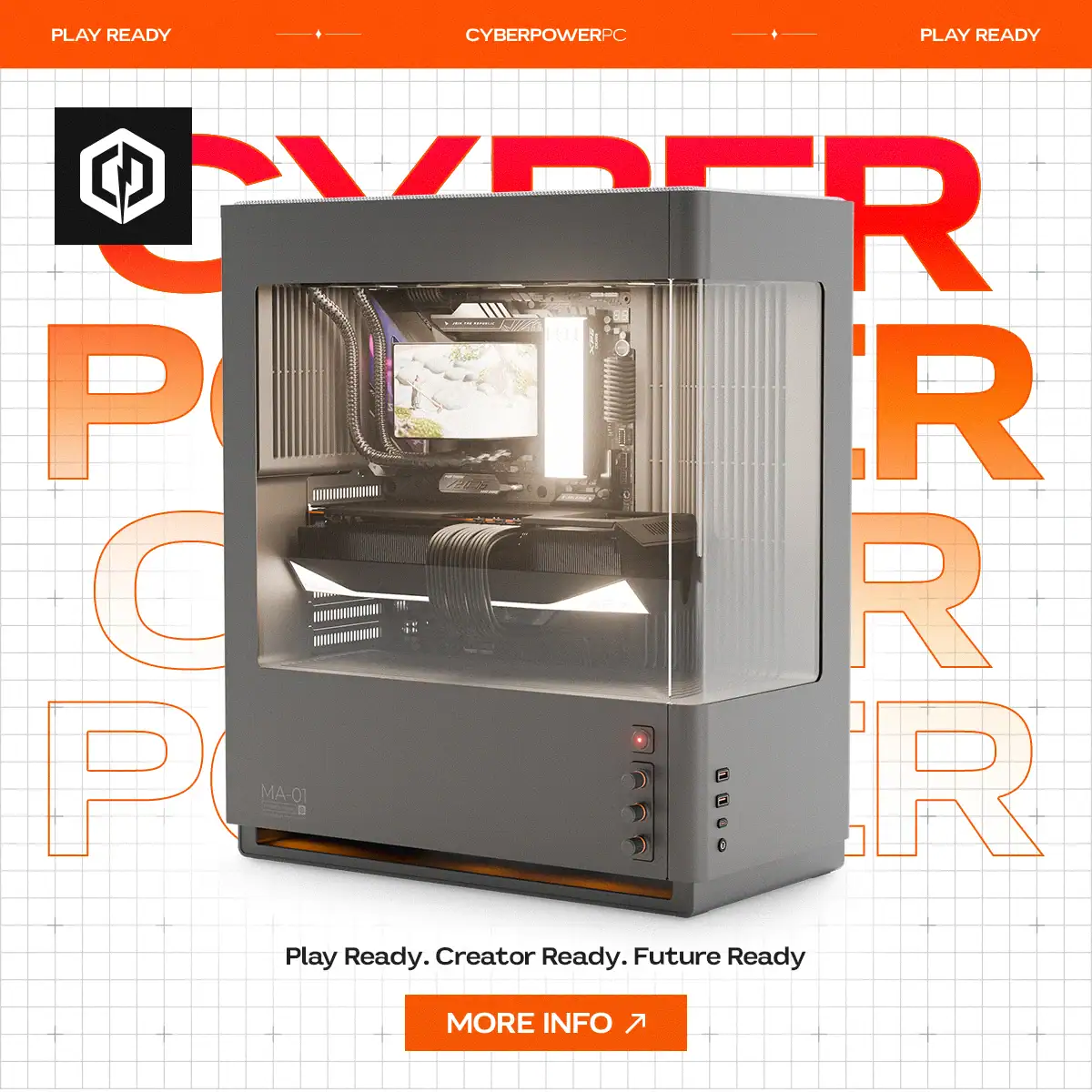
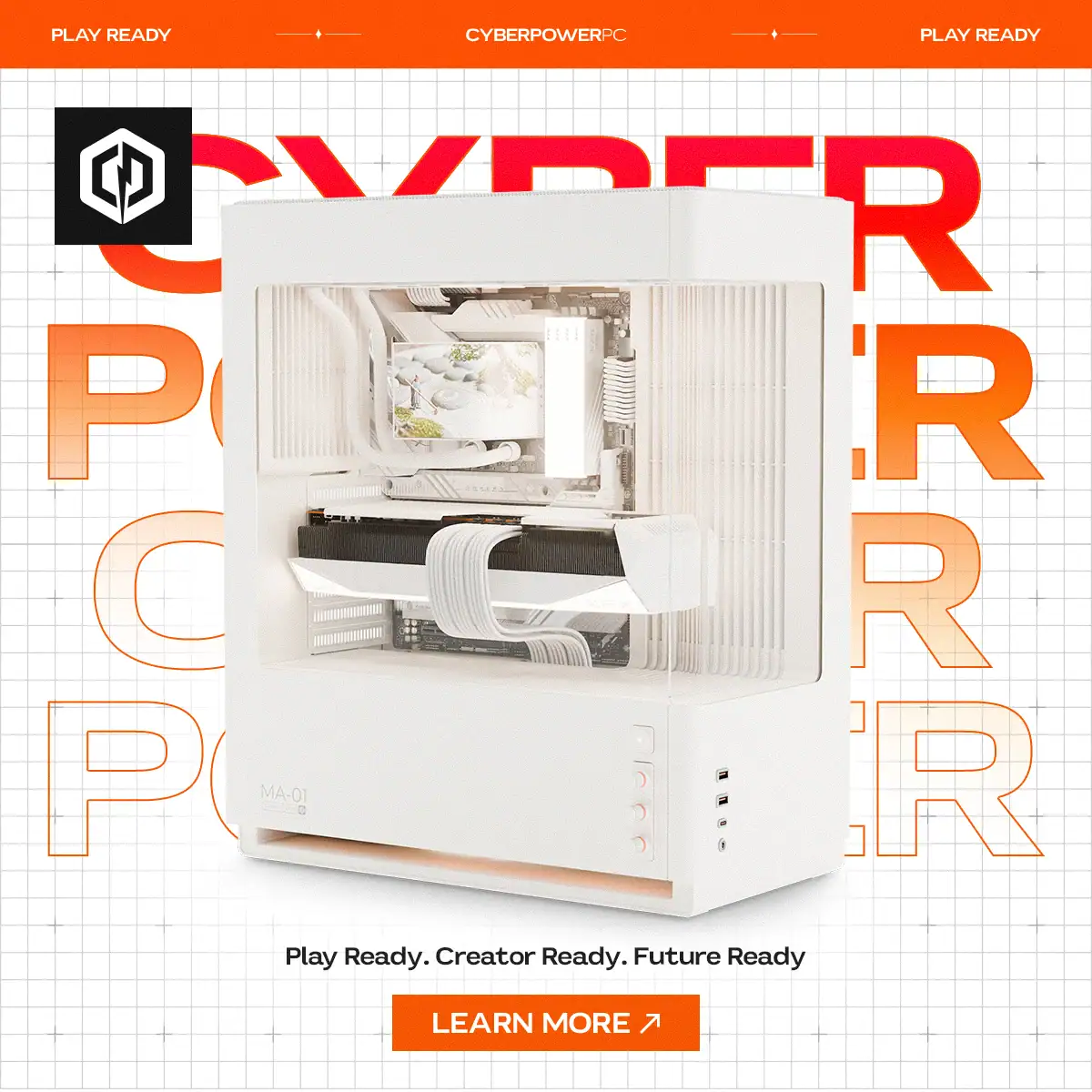
Campaign artwork shown in editorial settings.
04 / The buying experience
Energy to attract.
Clarity to choose.
I established the website’s design direction, then guided the web team through implementation. Product discovery, editorial content, and the buying experience each needed a clear place in the journey.
05 / A recognizable presence
Beyond
the bedroom.
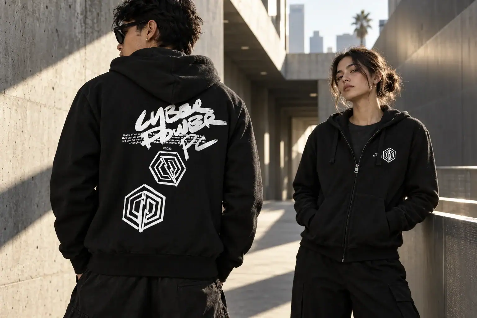
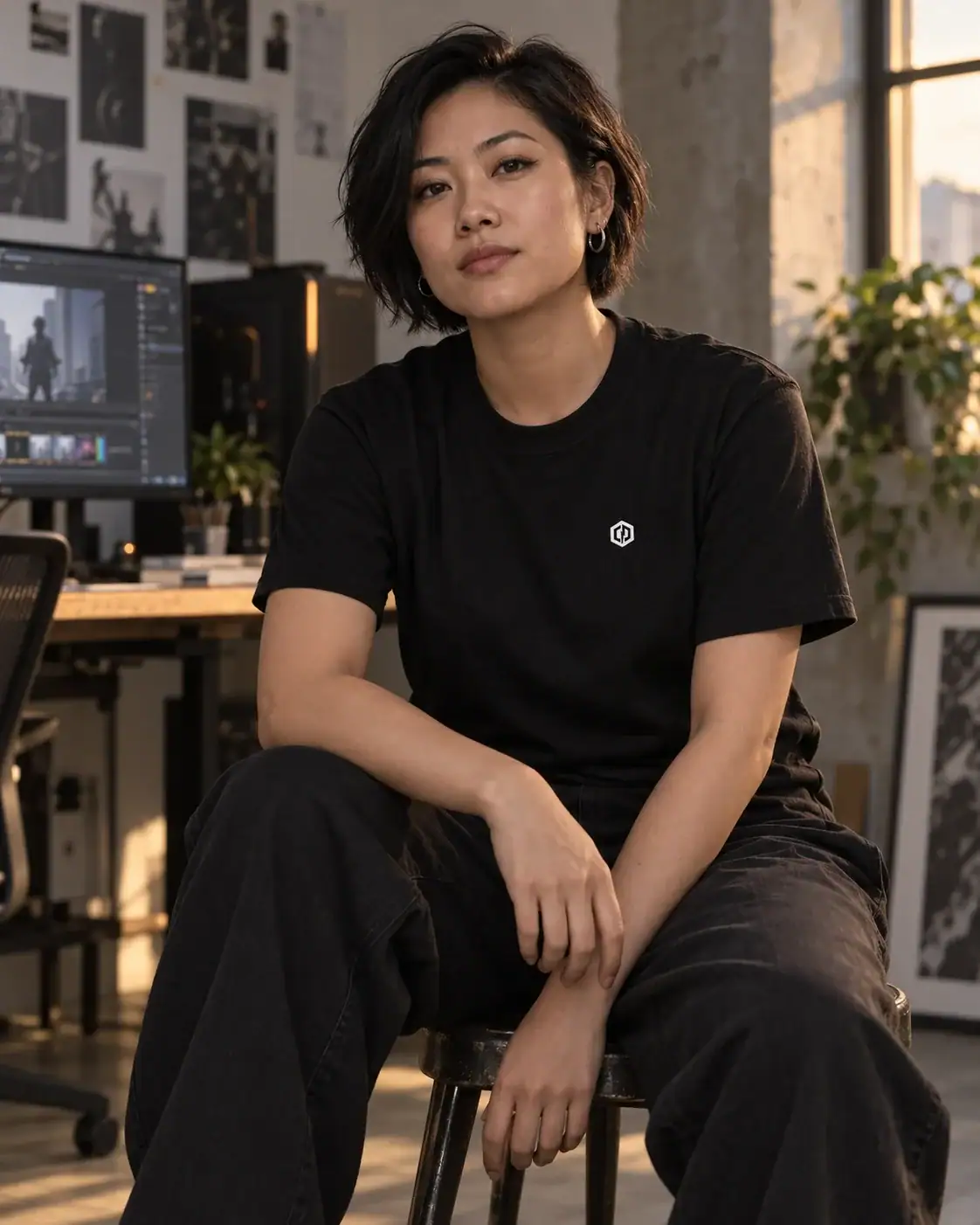
Apparel gave the brand a presence in everyday life. It could express the culture around the product, with room for both a quiet chest mark and a more expressive back graphic.
Five or six years into the work, people began recognizing the brand on my shirts and telling me they owned a CyberPowerPC. Those encounters gave me more confidence in letting the icon stand on its own.
06 / Building owned IP
A brand can have
a world of its own.
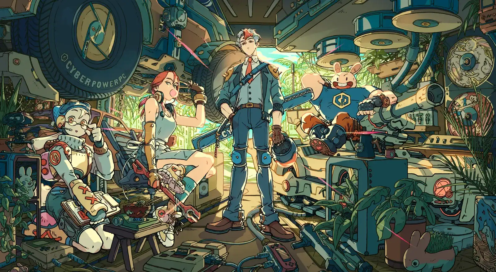
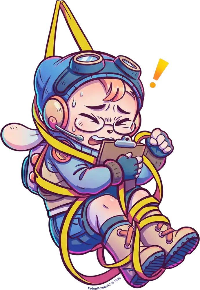
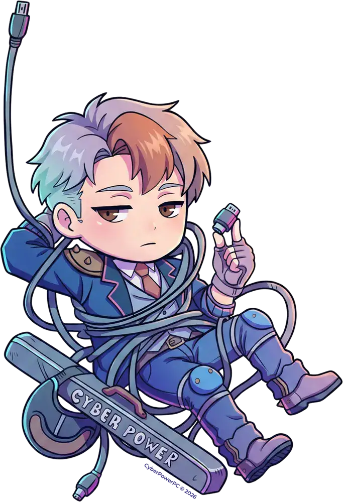
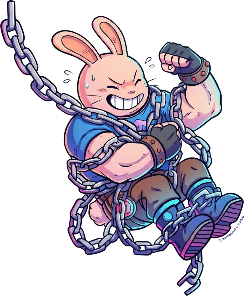
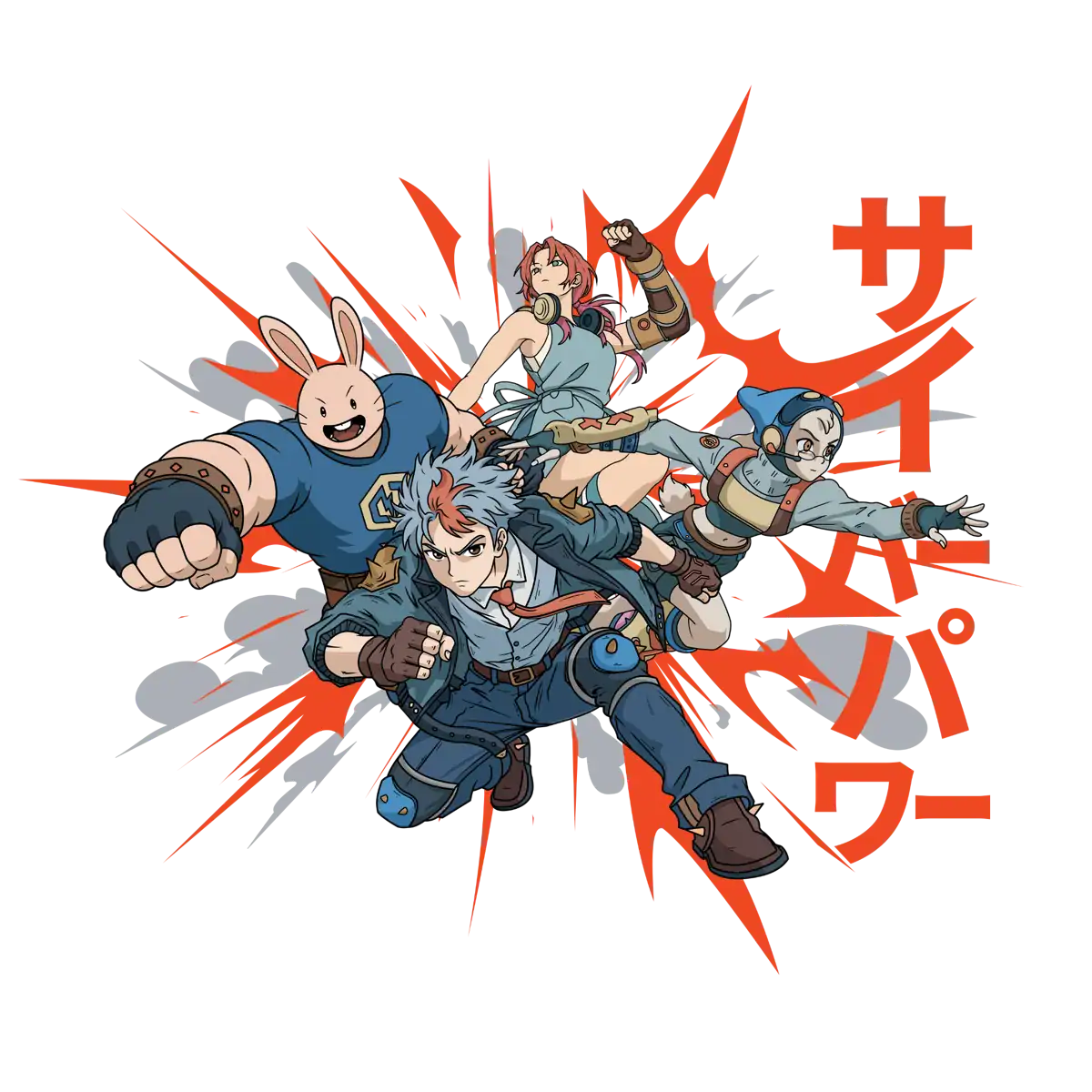
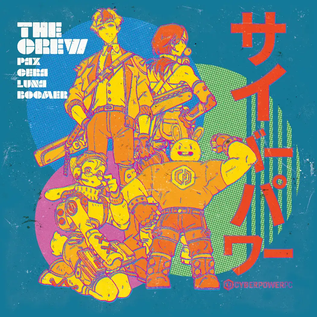
CP Crew is the next extension of that thinking: a cast of original characters we are beginning to integrate across our marketing.
The goal is to create recognizable personalities and a visual world that can grow across campaigns, content, and apparel. The identity becomes something people can follow, as well as something they recognize.

The lasting contribution
A direction the
team could carry forward.
I moved from designing most of the early work personally to establishing the direction, setting the standard, and helping the team apply it across more channels.
The work created a recognizable foundation with room for different expressions. Consistency came from shared judgment about the audience, the product, and the job each piece needed to do.