I like Jaguar’s new wordmark more than I like the fashion film that introduced it. The lettering feels modern, restrained, and surprisingly approachable for a luxury car brand. The film takes me somewhere much more theatrical: a world of sculptural clothes, saturated color, and people who look as though they have arrived for a very exclusive opening night. My initial reaction was that these two expressions were having slightly different conversations. Asking who Jaguar actually wants in that conversation changed how I judge the work.
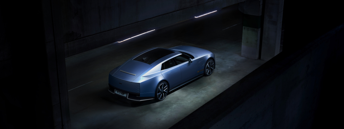
That question became more concrete with the Type 01’s October 6, 2026, reveal in New York. Jaguar finally has a production car to put behind the identity it introduced in November 2024 and the Type 00 concept it unveiled that December. Orders for the four-door electric GT are expected to open in early 2027, with first deliveries planned for the second half of that year and a U.S. starting price anticipated at $130,500. For the first time, we can judge the visual identity, the imagined customer, and the product that customer will be asked to buy as parts of the same proposition.
Start with the lettering. My first impression was that it was all lowercase. Looking more closely, the mixture of cases turns out to be one of its more interesting decisions. Jaguar describes the mark in terms of geometry, symmetry, and a blend of uppercase and lowercase characters. Those choices give it a controlled outline without making it feel as formal as a conventional line of heavy capitals.
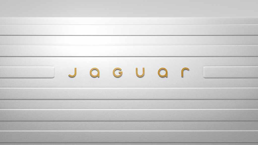
I tend to read lowercase lettering as friendly and personal. Heavy capitals often suggest institutions, permanence, and industrial scale to me. These are associations, of course, rather than rules of typography. Here, the more prominent J and G lend the softer shapes some authority, and the G creates a point of emphasis within the name. It is an unusual choice that happens to work with these particular letters. Another brand could copy the mixed-case idea and get an entirely different result.
There is a practical design consideration, too. A conventional lowercase g would drop a descender below the baseline. Keeping the letters within a consistent height can make a mark easier to fit inside a physical emblem or a bounded panel on a car. I cannot claim that manufacturing was the designer’s reason for doing it. But when I look at the solution as a designer, I can see how its geometry could earn its keep beyond a page or a screen.
The accompanying monogram does less for me. It is simple and serviceable, and I do not find it especially memorable yet. That is a limited criticism. Recognition accumulates through use, and some of the distance between a good mark and a supposedly great one comes down to taste and familiarity. A logo also has to survive several generations of products. We should give it room to do that before deciding its entire future from a single application.
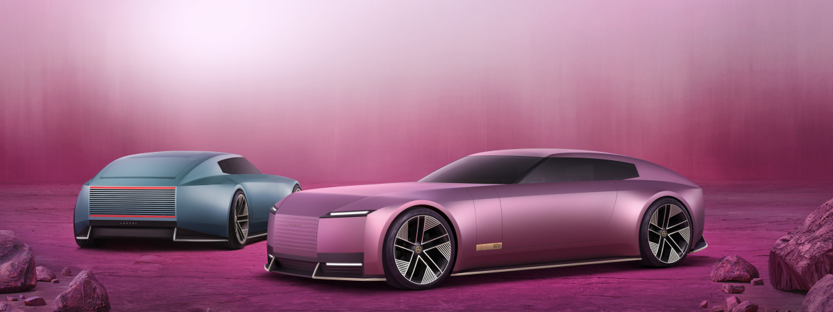
The cars give me a more mixed reaction. The rounded lettering sits comfortably inside the horizontal treatment on the front, where the immediate composition feels considered. Viewed as a whole, though, the design carries a tension between a substantial, almost architectural front and the suggestion of sleekness and speed farther back. Parts of it remind me of the imposing presence of a Rolls-Royce or Maybach. I would have preferred a little more softness and sportiness up front. Still, a disagreement about proportions is a long way from declaring the identity a disaster.
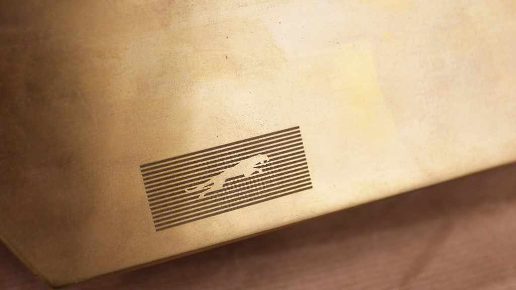
I also like the treatment of the leaping jaguar within the striped graphic. It keeps a familiar association while changing how prominently we experience it. To my eye, that is a smart way to make a transition feel connected without repeating the old presentation unchanged. Jaguar calls the leaper its “precious mark of provenance,” and any prediction that it will eventually disappear goes beyond what the company has announced.
The launch film is where my sense of coherence starts to wobble. Watch it before deciding whether that is a fair criticism. The movement, clothes, casting, and color carry much of its meaning, and calling it a fashion campaign only gets us part of the way there.
The film makes sense alongside the words Jaguar chose for its launch: fearless, exuberant, compelling. It is a very literal interpretation of those words through the visual language of experimental fashion. My question is whether that interpretation makes the best connection with the product and the buyer. Fearlessness could be expressed through engineering. Exuberance could emerge through architecture, materials, or the way a car feels on the road. A creative brief can leave all those doors open, or its mood board can quietly close most of them before the work begins.
At first, I felt the film missed that connection. The wordmark suggested a modern luxury that was becoming easier to approach, while the fashion suggested a smaller and more exclusive cultural world. I could imagine the same imagery working comfortably for a fashion house whose audience already understood the relationship between its established identity and a provocative collection. Jaguar was asking viewers to learn a new visual identity and a new cultural context at the same time. That is a lot of interpretive work to assign to a short film.
Audience changes the assessment. In WIRED’s coverage of the Type 01 reveal, Jaguar managing director Rawdon Glover says the car will have to earn its place with “almost an entirely new client base,” which the magazine characterizes as younger, more affluent, urban, independently minded, and creative. That gives the fashion direction a more plausible purpose. Urban alone says very little about someone’s spending power or taste, and wealth does not automatically produce an appetite for avant-garde clothing. Still, a campaign aimed at a specific luxury audience can reasonably tolerate indifference from people outside it.
The analogy that helps me most is couture. A runway presentation can push a visual idea much further than the garment someone eventually wears in everyday life. Its role is to expand the imagination and set a direction that can later be interpreted in a more wearable form. Through that lens, Type 00 functions as the runway statement and Type 01 as the expression a customer can consider owning. I mean that as a way of understanding their public roles, not as a claim about which car the designers developed first.
That reading makes me less inclined to dismiss the film. It could create a halo around the product, giving a relatively small audience a world it wants to enter. The unresolved question is whether Jaguar’s intended buyer makes that connection. A customer has to travel from admiring the imagery to seeing a place for the actual car in their life. The product’s design, experience, price, and performance all have to help finish that thought.
“The unresolved question is whether Jaguar’s intended buyer makes that connection.”
I would have taken a more historical route into the change. Picture a counter moving through the decades, with the zeros opening into brief glimpses of earlier lettering and cars. As the years advance, we see the design change while certain ideas remain. The final zeros stretch into a line, that line separates into two horizons, and the new wordmark forms between them. The camera then pulls back to reveal it on the car. That would be my way of helping the audience see how the company arrived here before asking them to follow it somewhere new.
An anniversary could give that story a natural occasion, provided the dates actually fit. Jaguar marked the 90th anniversary of its name in 2025, pairing the 1935 SS Jaguar with Type 00 in London. The company has therefore made a historical connection of its own. My preference would have been to make that continuity central to the first explanation of the new identity rather than a chapter added a year later.
Showing the journey, however, does not give existing customers a veto over the destination. People change how they dress, the communities they join, and the parts of themselves they express. Brands go through similar social negotiations. In Jaguar’s case, standing still was not a safe option either: Motor1’s analysis of registration data shows the brand falling from a record 180,833 cars in 2018 to 61,661 in 2022. If a company has decided that its future lies with a different audience, it needs the research and the product to support that decision, followed by the commitment to carry it through. Some people will drift away. Retreating every time that happens can leave a company trying to satisfy expectations that no longer fit together.
My assessment of Jaguar is therefore more qualified than my first reaction to the film. I like much of the identity, have reservations about some of the visual relationships, and can see a credible strategic role for the fashion direction. What remains to be demonstrated is the connection between that direction and a viable audience. That is the lesson for any brand attempting a reset: an identity can announce who you want to serve, but only the product can persuade them to buy. Jaguar has shown us a world it wants to belong to. The Type 01 now has to give its intended customers a reason to belong there with it.