A logo is one of the easiest parts of a brand to argue about. Everyone can see it, everyone has a preference, and a room full of people can spend an afternoon debating a curve without having to resolve the harder question: what should this business mean to the people buying from it?
That is where logo design starts receiving more responsibility than it can carry. A mark can make a business recognizable. It can signal a personality, help a product stand out, and connect one encounter to the next. It cannot make unreliable service dependable or give an undifferentiated product a reason to exist. Those are brand problems, too, even when they do not arrive in the design department.
I think of the logo as a handle on a much larger set of associations. The design makes those associations easier to find. The business has to give people something worth finding.
Why a new logo can feel wrong before it works
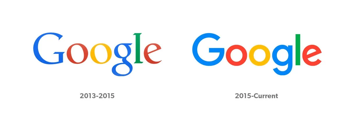
Google’s September 2015 redesign is useful because the company explained the problem it was solving. Its identity had to work across small screens, different devices, and interactions beyond typing into a desktop browser. The new wordmark and related symbols were part of that broader system, according to Google’s announcement. The change was more than a preference for a different font.
That does not mean every customer had to like it. Internal teams encounter a proposed identity repeatedly while it is being developed. Customers often encounter it for the first time when the company announces that this is now the answer. The two groups are not judging the design from the same starting point.
Research on mere exposure examines how repeated encounters with a stimulus can increase positive attitudes toward it. Familiarity is therefore worth considering when people react to a redesign. It is not a diagnosis of every negative comment, and it does not prove that any bad design will eventually become good.
The useful response is to separate unfamiliarity from a functional problem. Can people still recognize the brand? Is the name legible? Does the design work where customers actually encounter it? Is something meaningful being lost? Those questions provide more direction than counting how many people preferred yesterday’s version.
A recognizable mark carries a relationship
The significance of a logo grows through what becomes attached to it. A pair of shoes can mean athletic performance, belonging, a particular period in someone’s life, or simply a product that fits well. The same mark can hold different meanings for different people. That is why a logo discussion is often a discussion about identity disguised as a discussion about typography.
Nike offers a particularly clear example. Nike’s own archive traces the Swoosh to Carolyn Davidson’s work in 1971 and describes how its early applications varied across shoes and apparel. Recognition developed alongside products, athletes, and repeated public appearances. The drawing did not arrive with all of that meaning already inside it.

Davidson made the point neatly in a 2016 interview: “If they didn’t have the savvy, it would have been just another drawing.”
That observation gives design its proper place without diminishing it. A useful mark becomes a consistent way to retrieve a growing body of meaning. Poor design can make that retrieval harder. Strong design helps it happen, but the associations still have to be earned through the rest of the business.
What Starbucks kept when it removed the words
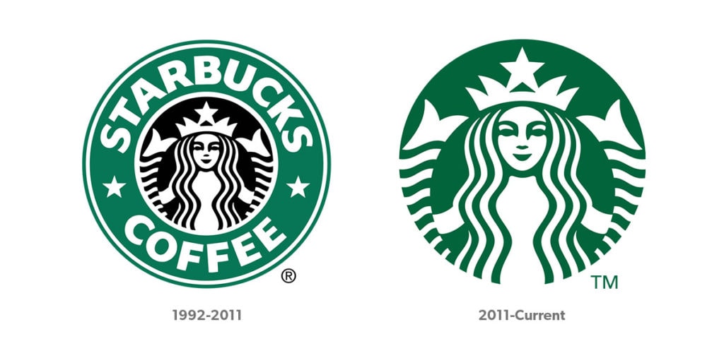
Starbucks introduced a simplified Siren logo in 2011, a milestone documented in its official logo history. The comparison below shows the name and surrounding ring giving way to a larger standalone symbol. It is a useful example of changing the visual expression while retaining a recognizable element.
The strategic question is not whether every brand should remove its name. Most should be cautious about borrowing the behavior of a brand whose symbol already has substantial recognition. A business still introducing itself may need its name more prominently, not less.
Nor does the continued presence of a company prove that a particular redesign had no commercial effect. Sales, customer habits, distribution, product quality, and competitive conditions all interact. Without evidence that isolates the change, it is more honest to discuss what the identity was designed to do than to credit or blame it for the whole business.
For a luxury brand, a visible symbol may also communicate affiliation or status. For another business, it may primarily help people find the right product quickly. The role depends on the audience and the buying situation. That role should be understood before the drawing begins.
The promise has to survive the experience
A visual identity can introduce a promise. Product and service determine whether that promise remains believable. If a company wants to be seen as reliable, the useful evidence includes whether the product works, whether instructions make sense, and whether someone takes responsibility when something goes wrong. Repeating the word “reliable” beside a carefully drawn symbol does not supply that evidence.
Innovation creates a related tension. Customers may want improvement while depending on familiar ways of doing things. A change that makes a product more capable can also make it harder to understand. The brand team should be asking how to explain the change, protect what people value, and support the transition. That is a much larger job than making the launch graphics feel new.
This is where brand strategy becomes connected work. The message, product, packaging, support, and customer experience need to reinforce one another. A coherent identity helps people recognize the connection. It cannot repair a contradiction between what the company says and what it does.
Timeless does not mean everything becomes black and white
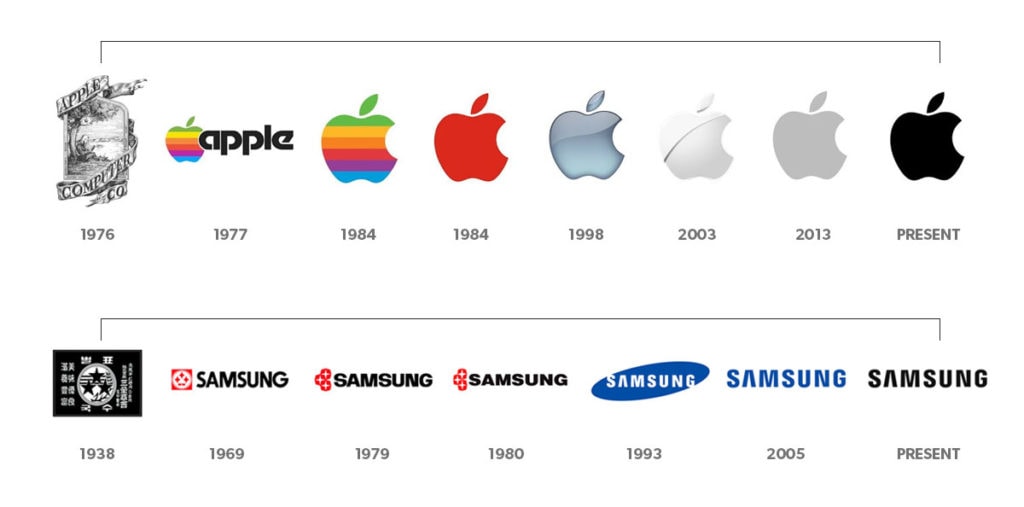
The older version of this article treated simpler, monochrome logos as the natural destination for major brands. That was too broad. A usable one-color version can be valuable without requiring a company to abandon color throughout its identity. Samsung’s brand guidance, for example, includes blue, black, and white lettermarks.
Burberry also complicates the idea that modern luxury branding must discard its symbols. The company describes its refreshed Equestrian Knight Design as a source of inspiration across products, stores, and brand activity. Heritage can remain an active design resource rather than something modernization must remove.
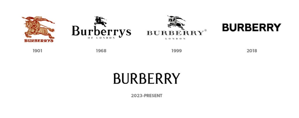
The better principle is functional flexibility. A logo may need to work on a phone screen, an embroidered sleeve, packaging, a sign, or a small product component. Each application has constraints. Fine details that look beautiful in a presentation may disappear at small sizes. A full-color treatment may need a simpler alternative for a particular production process.
I have seen startup brands become attached to complex, multicolor designs before considering how they would reproduce them. The practical lesson is to test applications before committing. Production costs depend on the method, materials, quantity, and supplier, so a one-color mark is not automatically cheaper in every situation. It is a useful option to have, not a universal business model.
Simplicity should make the identity easier to use without removing everything distinctive about it. If the end result could belong to any competitor after changing the name, the design may have solved a production problem while creating a recognition problem.
Start with the business you want people to recognize
Before discussing a new mark, define the problem in plain language. Perhaps people misunderstand what the company offers. Perhaps a product has evolved beyond the identity that introduced it. Perhaps the current mark is difficult to read, too similar to a competitor, or poorly suited to the places it now appears. Each situation calls for a different brief.
Then establish what should remain. Existing recognition is an asset, even when parts of the identity need improvement. The name, proportions, symbol, color, or some combination of them may provide continuity. Keeping everything is not always sensible. Discarding everything is not automatically brave.
Look at the identity beside the competition and in realistic applications. A mark on a blank presentation slide tells you less than a package on a shelf, a small search result, or an actual product. Ask customers what they recognize and understand, not only which option they like. Preference is useful information, but it is not the entire job description.
Finally, connect the visual work to the experience it represents. What will change in the product, service, messaging, or behavior of the business? If the honest answer is nothing, the redesign may still solve a legitimate visual problem. It should not be presented as a transformation of the whole brand.
What a useful logo-design brief should answer
A brief should identify the audience, the competitive context, the desired association, and the practical places the mark must work. It should explain what recognition must be preserved and what is currently getting in the way. Those decisions give the designer something more useful than a folder of logos the leadership team happens to like.
For a young business, a carefully considered wordmark can be a reasonable starting point. That does not make every available font or template appropriate, and it does not eliminate the need to check usage rights and distinctiveness. The goal is a usable identity supported by a clear proposition, not a shortcut that becomes expensive to replace.
Practical questions about logo design
How do you start designing a logo?
Start with the brief, then explore several directions before refining one. Test the mark at small sizes, in one color, on light and dark backgrounds, and in the applications you will actually use. Keep a scalable master file and clear guidance for reproducing it. Software helps produce the artwork; it does not decide what the brand should mean.
How much should a logo cost?
There is no single useful price without a scope. A logo-only assignment is different from research, positioning, a complete identity system, application design, and rollout support. Ask proposals to specify deliverables, revisions, usage rights, source files, and implementation work. Compare equivalent assignments rather than treating every quote as a price for the same thing.
What should you avoid?
Avoid copying competitors, using assets without appropriate rights, and approving a design only at presentation size. Do not add detail merely to make the mark feel more valuable. Also avoid redesigning simply because the internal team is bored. Customers may have seen the identity far less often than you have.
What makes a logo useful?
It should be recognizable, appropriate to the audience, and reliable in its intended applications. Distinctiveness matters, but so does the ability to reproduce the mark consistently. “Timeless” is an aspiration, not a test that can be passed before a design enters the world.
What three qualities should you prioritize?
Recognition, relevance, and usability are a practical starting point. People need to connect the mark with the right business, understand enough of its character, and encounter a clear version wherever it appears. The balance will differ by brand and context.
Give the logo a job it can actually do
A logo deserves serious thought. It also deserves a realistic assignment. Let it make the business easier to identify, help its communications feel connected, and carry associations that become stronger over time. Put equal thought into what creates those associations in the first place.
The most productive brand question is not “How do we make people love this shape?” It is “What are we building that will make this shape worth recognizing?”
Related reading: building brand awareness and the role of storytelling in marketing.
Original audio edition
The audio below accompanies the original article and may differ from this revised text.