
A micro-moment is not a stopwatch. It is the point when a vague need becomes specific enough for someone to act.
Someone wants to understand a term, find a nearby store, fix a problem, or choose between two products. They reach for a device because they need a useful next step. The marketer’s job is not to interrupt that moment with the loudest message. It is to make the next step easier.
Google popularized the language of micro-moments in 2015, when smartphone behavior was rapidly reshaping the customer journey. The original framework grouped these intent-rich moments into four categories: I want to know, I want to go, I want to do, and I want to buy. Google now describes micro-moments as a milestone in a decade of digital marketing insights, which is a useful reminder that this is an older framework, not a new trend. The language has aged, but the underlying design problem has not: people still expect clear help when intent becomes immediate. Think with Google documents the framework’s 2015 origin.
What a micro-moment means now
The phrase is most useful as a planning lens. It asks a better question than “How do we get attention?” The better question is, “What is this person trying to accomplish right now, and what would make that easier?”
That shift matters because intent is more specific than a demographic profile. A person can be researching for work in the morning, looking for a repair guide in the afternoon, and comparing a purchase that evening. The same person brings a different standard of usefulness to each moment.
| Intent | The real job | A useful response | A meaningful signal |
|---|---|---|---|
| Know | Understand or compare | A direct answer, explainer, or comparison | The person finds the answer or explores a relevant detail |
| Go | Reach a place or service | Accurate location, hours, availability, and directions | A call, route request, booking, or store visit |
| Do | Complete a task | Clear instructions, a checklist, or a short demonstration | The task is completed with fewer support steps |
| Buy | Choose with confidence | Fit, price, availability, proof, and an honest next step | A qualified conversion, not merely a click |
Not every moment is urgent, and not every person is ready to buy. “I want to know” often belongs near the beginning of a decision. “I want to do” may happen after the purchase. Treating every signal as a sales opportunity is how a useful framework becomes a bad targeting habit.
Three ways to design for micro-moments
1. Map the customer’s real job
Start with the questions, frictions, and decisions that surround the experience. Search queries can help, but so can on-site search, support conversations, sales notes, product reviews, and the questions people ask before and after a purchase. Look for repeated tasks rather than isolated keywords.
A coffee customer trying to avoid a line does not need another lifestyle message. They need ordering, payment, pickup timing, and location information to work together. The original Starbucks example in this article remains useful because it shows the brand responding to the job, not simply advertising around it.
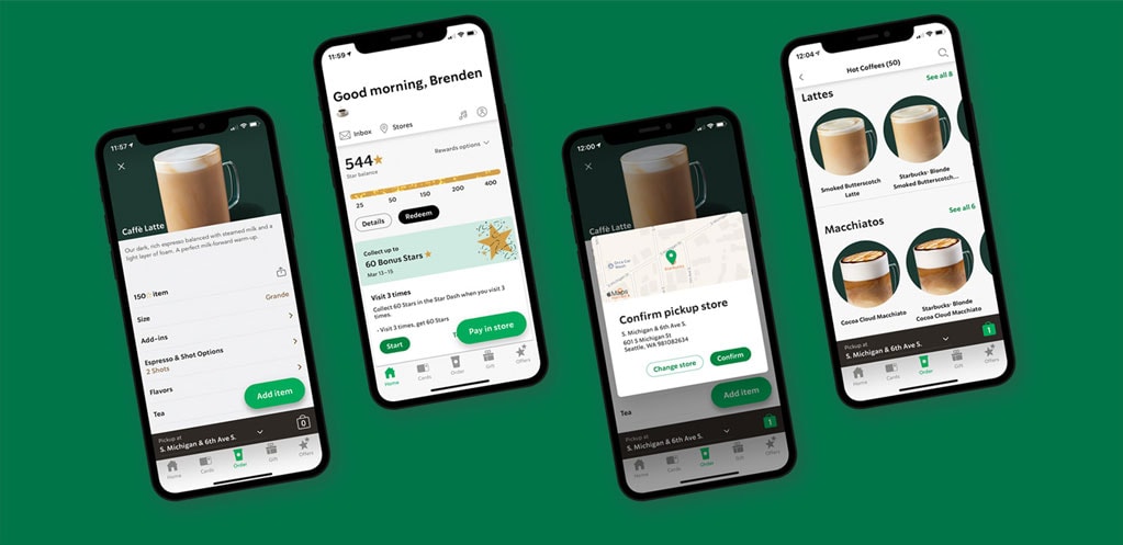
Build a simple moment map. For each repeated need, record the context, the question, the best response, the owner of that response, and the next useful action. This prevents a content team from publishing an answer that the product, store, or service cannot support.
2. Match the answer to the moment
Usefulness changes with context. A comparison made at a desk can support depth. A repair question beside a broken appliance may call for a diagram or a one-minute demonstration. A local search needs accurate hours and inventory. A purchase decision may require specifications, delivery information, and evidence from people who have used the product.
Do not confuse “quick” with “thin.” The first screen should orient someone quickly, but the page should still make deeper evidence available. A concise answer can lead to a table, calculator, technical document, or full explanation. Progressive disclosure gives people speed without withholding substance.
This is also where page experience becomes part of the message. A relevant answer that shifts around, hides behind an interstitial, or performs poorly on mobile is not fully useful. Google’s current guidance treats Core Web Vitals as one part of a broader page experience that also includes security, mobile display, restrained advertising, and clearly distinguishable main content. Google’s page-experience guidance is a better standard than repeating a single dramatic page-speed statistic.

3. Measure whether the next step became easier
Clicks and time on page can be diagnostic, but they are not the outcome. A short visit may mean someone found the address immediately. A long visit may mean a comparison was valuable, or that the page was confusing. Choose a measure that reflects the job.
- For know moments, track answer visibility, relevant follow-on reading, and repeated support questions.
- For go moments, track calls, direction requests, reservations, and confirmed local actions where available.
- For do moments, track task completion, repeat attempts, and support contacts.
- For buy moments, track qualified conversions, returns, cancellations, and post-purchase satisfaction.
Use aggregated, first-party evidence wherever possible, and collect only what the decision requires. Consent is not a technical afterthought. Google’s consent mode, for example, is designed to pass a person’s consent choice to Google tags so their behavior adjusts accordingly. It does not replace a consent banner or the responsibility to design a lawful, understandable choice. Google Analytics explains how consent mode works.
Then test the weakest part of the path. If people find the guide but still call for the same basic instruction, improve the guide. If a store page attracts traffic but fails to show current inventory, fix the operational gap. Measurement should help the experience learn, not merely help a dashboard look busy.
Create for intent, not for a phrase
Micro-moment planning can produce a useful editorial system when it begins with genuine expertise. A durable answer should explain the issue clearly, show the evidence behind it, and give the reader a sensible next step. That aligns with Google’s current recommendation to create helpful, reliable, people-first content rather than material made primarily to attract search traffic. Google Search Central’s people-first content guidance provides a practical self-assessment.
The old temptation was to build hundreds of small pages around every possible keyword. That fragments the experience and often leaves people with generic answers. A better approach is to organize related moments around a real decision. One strong guide can support the initial definition, the comparison, the implementation question, and the next action, as long as navigation makes each layer easy to reach.
A useful example and a useful distinction
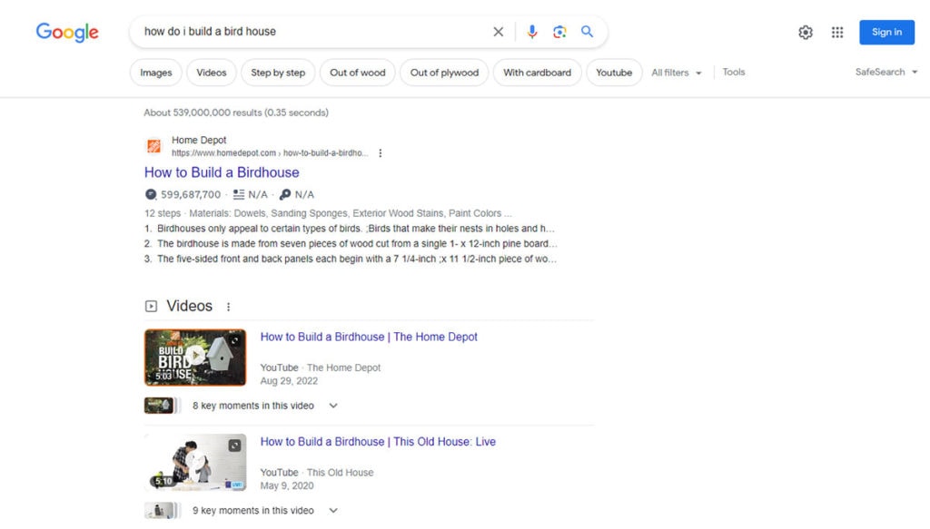
The Home Depot how-to example from the original article is a clean “I want to do” case. Someone standing beside a project can find instructions that help them complete it. The content also connects naturally to tools and materials without making the product pitch the opening move.
By contrast, Oreo’s response during the 2013 Super Bowl blackout was excellent reactive social marketing, but it is not the clearest example of the four intent categories. It captured a cultural moment more than it answered a specific task. The distinction matters because “micro-moment” should not become a label for every fast marketing response.
A practical micro-moment checklist
- Intent: What is the person actually trying to know, find, do, or choose?
- Context: What device, location, urgency, and level of risk shape the answer?
- Usefulness: What information or function removes the most friction?
- Proof: What evidence helps the person trust the answer?
- Next step: What action is natural, clear, and proportionate?
- Measurement: What would show that the job became easier?
- Respect: Can you learn enough without collecting more data than the experience needs?
Micro-moments are not the future of marketing. They are a durable way to examine the present. When intent becomes clear, brands earn attention by being useful, fast enough, and honest about the next step. The advantage is not simply showing up in the moment. It is deserving to be chosen there.