Why Logo Design Is Only A Small Part Of Your Brand Strategy
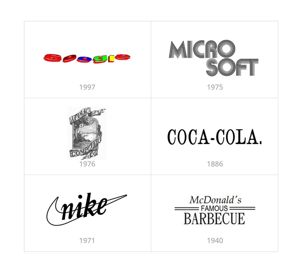
Logos seem like the dazzling stars of the branding universe. You might think they’re the DNA of a successful brand—the thing that makes or breaks it. After all, who could forget the iconic Google logo design that’s been a mainstay since 1999?
Then, one day in 2015, Google changed its font and boom! Collective online meltdown. It’s like when your grandma suddenly decides to dye her hair neon pink.
It was shocking at first, but is it that big a deal in the grand scheme?
Let’s unravel why a logo isn’t the be-all and end-all of business branding and why you might be giving it too much weight.
Key Takeaways (TLDR)
- The uproar over logo changes often stems from the familiarity effect.
- Emotional connections between consumers and brands are crucial.
- The true substance of a brand lies in its personality, values, and messaging.
- Brands are valued not only for their logos but for their innovation, reliability, and service quality.
- Time-tested brands thrive due to their consistent core ethos and character.
The Familiarity Effect In Branding
The Google logo saga is a prime example of the emotional havoc a brand’s visual changes can cause.
People lashed out, throwing comments like, “It looks like it was designed by a toddler discovering Comic Sans!” Or even, “The new Google logo font looks like fridge magnet letters. Not a bad thing.”
As it turns out, this uproar is our brain’s knee-jerk reaction to change—a cognitive hiccup known as the familiarity or mere exposure effect. It’s the same vibe you get when you walk into your childhood room and find it’s been turned into a gym; unsettling, right? But eventually, we adjust, and sometimes, we even dig the new setup.
The premise is that the more you are exposed to something, the more you become familiar with it and eventually prefer it.
Your logo will change and must change over time. It’s inevitable, which brings up a critical point. People will love and hate your logo regardless, and it has little to do with how it looks. Given time, they may love it no matter how it looks and hate it when you change it.
The thing to keep in mind is that some of the most beloved brands in the world didn’t start with an amazing logo. Some logos were pretty mediocre, and not just because of their age. They were pretty bad for their time. However, despite their logos, these logos did not stop them from becoming successful.
Emotional Connection: What Matters Beyond the Logo Design?
Emotional connections are the glue that keeps relationships together, whether we’re talking about romance, friendships, or—brace yourself—the bond between a consumer and a brand. That emotional connection is just as real and might last longer than some human relationships.
The tale of the changed Google logo design that people couldn’t stop whining about is almost like that friend who got a haircut, and everyone suddenly acted like he had betrayed them. “What? You’re not the same Steve anymore!”
It’s curious, isn’t it? We’re not married to these brands, but people act like someone changed the alphabet when a logo maker tweaks its font.
Karen Winterich, an associate professor of marketing at Pennsylvania State University, explains well how we’ve adopted these brands into our daily rituals. Because logos reflect us in many ways, change the logo design, and it’s almost as if you’re saying, “I’m no longer what you thought I was.”
In many cases, brands are integral parts of people’s identities. It’s the reason people might choose a luxury brand over a cheaper one. The brand symbolizes a particular class or social status. So when a logo changes, it’s natural for consumers to ask, “If your logo changed, did anything else about you change with it? Are you still everything I love about you or something different?”
A strong brand that has weathered the seasons (and the occasional PR storm) tends to be the one that has established a strong emotional connection. Longevity in the marketplace is a key contributor to the “familiarity effect.” You’re more likely to stick with a consistent brand that has been reliable over the years, even if it’s not the prettiest logo design on the block.
The Mirage of Creating the Perfect Logo Design
Here’s where it gets interesting. Logos might be the “first impression” you get from a brand, but they’re not the end game. In the grand pageant of branding, if the logo is the evening gown, then the brand personality, values, and messaging are the interview and talent portion of the show. And we all know that’s where the real substance comes out.
Let’s face it: spending too much time on your logo, trying to perfect it, is like spending hours in the gym obsessing over your biceps while ignoring the rest of your body. Don’t be that brand.
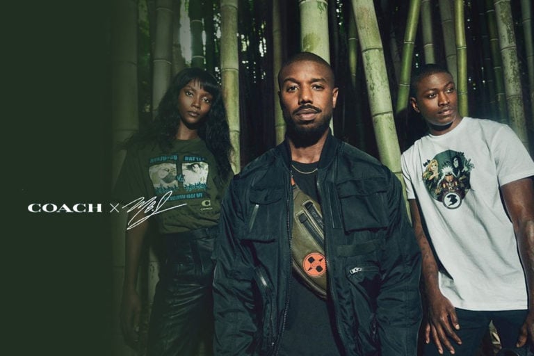
Big names like Nike, Coca-Cola, and McDonald’s aren’t immune to logo controversies. But their logos aren’t their legacy.
Nike’s swoosh designer, Carolyn Davidson, put it perfectly: “If they didn’t have the (business) savvy, it would have been just another drawing.”

If they didn’t have the (business) savvy, it would have been just another drawing.
Carolyn Davidson – Nike’s Swoosh Designer
Logos are still important. Wait, What?
I’m not trying to say that logos are irrelevant. It’s like your appearance in the business world—important but not a deal-breaker. People will always judge your brand superficially at first.
An old-looking logo design may make your brand appear out of touch with modern times, which might imply that it is not reliable or low quality.
There are both great and ugly logos, but you only need a good enough logo design. Remember that less is more, so a simple logo design is often the best bet to avoid having a hideous logo. What makes a bad logo is often having too many things going on.
You need to put in some effort, but it’s probably much less than you think. The difficulty of creating your new logo is really up to you and how hard you want to make it for yourself.
Consider using tools like Canva‘s logo maker for a low-cost logo design. Forget the icon or color palette. All your custom logo needs is a clean, legible font to start.
Just know that people will remember how you made them feel and what you actually do for them long after they’ve forgotten what your logo looks like. Brands and businesses should remember that and invest in that emotional bank account with customers.
Is it mermaids, coffee, or something else?
I’ve seen plenty of rebranding of famous logo designs in my time. It always surprises me how attached people are to the old logo, even when, by all design standards, the new logo is significantly better.
Take Starbucks, for example. They removed the word “Coffee” from their logo design in 2011. Imagine that—a coffee shop without “coffee” in the logo! The company president and CEO, Howard Schultz, explained the direction: “We’ve allowed her to come out of the circle in a way that gives us the freedom and flexibility to think beyond coffee.” It sounds like a thoughtful and meaningful decision.
However, as usual, the public was not having it. The company’s Facebook page echoed their voices: “Who’s the bonehead in your marketing department that removed the world-famous name of Starbucks Coffee from your new logo?” and “HATE the new logo.” “Wall posts by the company revealed a similar consensus among Starbucks’ audience of over 19 million Facebook followers. “I love the peppermint white chocolate mocha! Hate the new logo!”
But people didn’t ditch their lattes and Frappuccinos. Why? Starbucks wasn’t just selling coffee; they were selling an experience, a third place between work and home. And boy, did they have emotional deposits in that customer bank!
By now, we’ve had a decade to become familiar with the new Starbucks logo, so much so that most people have probably forgotten how the original logo design even looked.
When you trace back the logo’s history, it’s clear that the new logo is certainly more appropriate to modern times and modern design principles of being clean, minimalistic, and bold.
New or old logo, it doesn’t matter, so long as the brand still delivers on its brand promise. What do you think would happen if they went back to the original logo design today? You are probably correct if you guessed fans would have a meltdown.
Brands Are Like Onions
Yeah, they make you cry when they change, but that’s not the point. Brands have layers, like onions! The logo is just the outer peel, the first thing you see. Peel back, and you’ll find other elements—voice, messaging, and customer experience—that make up the core. These are the layers that people stick around for.
A successful brand should always aim for equilibrium. Too much focus on the visual aspects, and you become that all-show, no-substance type. Too little, and you might be the best-kept secret no one’s ever heard of. Aim to be the strong brand that doesn’t just look good but feels good to be around, too.
Don’t stop at the logo; strive to make your brand an experience. Engage with your customers, listen to their needs, and adjust your products and services. When you do this, you’re not just a logo; you’re a brand people want to grow old with.
So what’s the takeaway? Successful brands are more than just a snazzy logo design or a catchy slogan. They’re created by an ensemble of various elements, like actors in a blockbuster movie, each playing their part to create a captivating story. And like any good tale, it’s not the book cover that keeps you hooked—it’s what’s on the inside that counts.
Innovation and Reliability: The Silent Forces Behind Brand Success
In the heated conversation about logos, we often sideline the real MVPs of good branding—innovation and reliability.
Remember the Google logo change of 2015 we discussed earlier? A new font, a slightly altered look, and boom—the internet went into full-blown meltdown mode.
Yet, the irony? People didn’t stop Googling stuff. Why? Google was more than just its logo; it was about innovation and reliability for consumers.
The search algorithms, the services, the UI, Google Drive, Gmail—the list goes on. Google isn’t great because its logo and website are spectacular; it’s great because it never stops innovating and improving, and its services always remain reliable.
Innovation: The Not-So-Subtle Art of Staying Relevant
Innovation in business isn’t just about cool gadgets or quirky free software updates; it’s about staying relevant. Ever wonder why brands like Microsoft, Apple, and Amazon have stayed on top of their game?
They’ve embraced change, sometimes even dictating it to competitors. Like that fashion-forward friend who knew about TikTok before anyone else, these brands set trends.
Innovation isn’t a blind leap into the unknown. It often taps into the “familiarity effect.” When Google altered its logo design, it stirred the pot, but the essence—the colors, the name—remained untouched.
Google knew you’d be irked by the unfamiliar but also counted on your psychological propensity to adapt and, eventually, prefer the new over the old.
But What About Reliability?
If innovation is the flash and sizzle, reliability is the steak. Imagine a coffee shop that changes its theme every week. One day, it’s ’70s disco. The next is a Harry Potter theme.
It sounds fun, but what if your favorite vanilla latte tastes different each time? You might admire the innovation but lament the lack of consistency. Google’s strength is in its balance; the features may evolve, but the core service remains as reliable as ever.
Reliability is comfort food for our brains. We internalize brands that are part of our daily lives. The reliability of Google isn’t just about not crashing when you hit ‘Search’; it’s that emotional safety net that assures you, “I’ve got what you need, anytime you need it.”
When Innovation and Reliability Clash
The relationship between innovation and reliability isn’t always smooth. Sometimes, they’re like an old married couple bickering at the dinner table.
Strong brand personality and values help buffer those moments when innovation and reliability seem at odds. For instance, when Apple removed the headphone jack from iPhones, it was an innovative leap but caused some reliability concerns. Yet, Apple’s consistent innovation brand provided the strength to navigate those turbulent waters.
At the end of the day, your brand’s success is not tied to a logo’s aesthetic value alone but to a more complex recipe. A concoction of innovation that keeps people intrigued blends perfectly with the reliability that makes them stay.
So go ahead and spice up your logo design if you must, but remember: it’s not the face of the brand but the soul that truly matters.
The Timeless Factor: Why Some Logos Age Like Fine Wine
You know that friend who somehow never ages? They hit 40, but their skin seems to defy the laws of physics and biology.
Well, successful brands aim for that kind of timelessness, too, especially regarding their logos. But the irony is, the timeless appeal of a logo doesn’t stem from how innovative or intricate the design of the logo is; it’s all about familiarity!
Think about well-established brands like Coca-Cola or Apple. Both have undergone logo design changes, yet they’ve managed to maintain a sense of timelessness. Why? Because our relationship with them goes beyond the pixels and colors. A logo might be the face of a brand, but the emotional attachment goes skin deep.
You don’t wear your favorite pair of jeans because they’re trendy; you wear them because they’re comfortable. The same principle applies to logos. Brands that have been around for a while build this sense of comfort.
Like how you know every hole and loose thread in those jeans, you identify with the curves, colors, and shapes in a logo design. This comfort contributes to the “familiarity effect”—our tendency to prefer things just because we know them well.
A Matter of Trust
Brands like Coca-Cola and McDonald’s have been around for ages, and they’ve had the time to build trust. When you’ve known someone—or some brand—for a long time, you’re less likely to be skeptical of them. That trust adds an extra layer of sheen to the logo, making it feel timeless.
A flashy logo design is like that guy at the party who’s too loud—you notice him, but you’re unsure if you like him. Established brands usually avoid too much glitz and glamour in their logos. They go for something more dignified. Their simple logos might not win design awards, but they win hearts, which, let’s be honest, is better.
A logo doesn’t live in isolation; it’s a part of the brand’s larger story. Your logo could be as shiny as a new penny, but if the product is terrible, it won’t matter. It’s like having a sports car but not knowing how to drive it. Aesthetics can catch the eye, but the brand’s character and values make the logo memorable.
It’s Not Just About Today
Fashion styles, like logo designs, are victims of time. What’s hot today will probably be laughed at in 10 years. Established brands are acutely aware of this. Their strong logos aim for a balance that will make them relevant today and tomorrow.
Most prominent, world-renowned brands tend to move towards black-and-white branding naturally. The modern logo design style is about simplicity, and countless brands have taken this route.
Look at the progression of companies like Apple, Samsung, and Lenovo, which have all transitioned to black and white branding.
Even luxury brands such as Louis Vuitton and Burberry, where color had played such an important role in their brand identity, have not only moved towards the simple black logo, but many have started to abandon their iconography altogether, opting for logotypes only.
But why are logos getting simpler? A simple black and white logo is a wise business decision. You gain huge savings from not having to print everything in four colors. I’ve seen so many startup brands demand complex multi-color logos only to realize later that they can’t afford to print everything in full color all the time.
Additionally, a single-color logo can help the brand name stand out more. Still, it will also work on nearly any medium. There are no concerns about the logo design clashing with products, packaging, advertising, digital, social media posts, etc.
Timeless logos are also often simple to give them maximum flexibility. They can be scaled up to any size or down to the size of a toothpick and still be easily recognizable and legible. Consider how luxury brands have to fit their logo onto a zipper where, in many cases, that is the only place to place their branding.
A timeless logo doesn’t have to break the bank. It doesn’t need to be fancy or complicated. It just needs to connect people with your brand’s core strengths.
Ultimately, a brand’s core strengths and character make its logo timeless. The success of giants like Coca-Cola, McDonald’s, and Apple isn’t due to just their visual identities; it’s about the total package.
If you want to create a logo and brand strategy that stands the test of time, start with building a brand that people can relate to and trust. Your logo and visual assets become the cherry on top of a well-baked branding cake.
Core Strengths and Character: The Real Backbone of a Brand Identity
Have you ever dated someone just because they looked like a million bucks, only to realize they had the personality of a paperclip? Yeah, that relationship didn’t last, did it?
A successful brand’s core strength lies in its personality—how it interacts with consumers, solves problems, and enriches lives. If a brand’s logo is its “dating profile pic,” its core strengths and character are its sense of humor, kindness, and intelligence, all of which make a long-term relationship worthwhile.
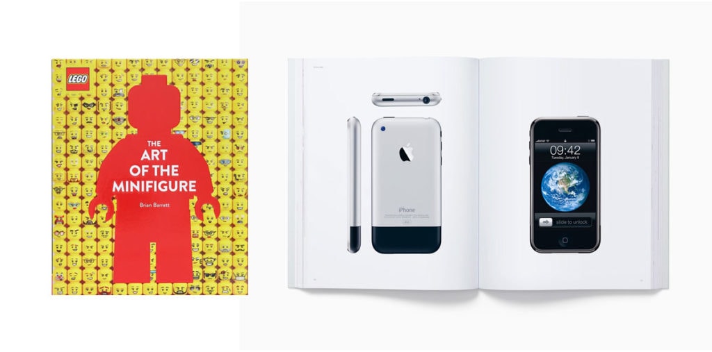
Brands that have withstood the test of time, companies like LEGO or Amazon, did so not just with their logos but with their core ethos. LEGO stood for creativity and learning; Amazon stood for customer-centricity. These brands were like that one friend who never seemed to age because their character remained so consistent, you could set your watch by it.
Brands such as Lego and Apple have transcended beyond the brand that there are entire artbooks, museums, and historical preservation archives around their brand. They have become a moment that will continue into the annals of history. They are at the point that no matter what they do with their logo design, it will not stop the masses from buying their products or supporting their cause.
Don’t Be a One-Trick Pony
Brands and businesses that rely solely on their logo or a single product risk becoming one-trick ponies to competitors. Their core strengths need to be versatile, adapting to changes in the market while staying true to the brand’s essence.
Statistics show that emotionally connected customers are more than twice as valuable as delighted customers. They buy more, advocate more, and are more loyal. The key?
Consumers’ emotional connection goes beyond customer satisfaction—a brand’s deeper, more intrinsic values and strengths bond people to it. Your brand’s core strengths are your MVPs—Most Valuable Principles.
Logos may come and go and get updated, but the brand spirit is what the fans come for. As your company or brand grows, you may change your logo design or your products, but you shouldn’t change your core principles.
Think Deeper, Aim Higher
A cool logo can give you a head start in the branding race, but your core strengths and character will get you across the finish line. While a trendy logo might get customers in the door, the whole experience—anchored by your brand’s character—will keep them from walking out.
So, put on your “brand goggles” and focus on the things that will stand the test of time. After all, what’s timeless is always trendy.
Key Considerations
If you’re thinking of focusing all your branding energy on crafting the perfect logo design, pump the brakes. A killer logo is cool, but what about your brand’s voice, tone, and core values? These are the elements that truly make your brand unique. It’s like focusing only on abs in the gym—sure, they’re nice, but you don’t want to neglect the rest of your body, do you?
Wrapping Up
Logos can be dazzling, but they’re not the magic elixir for brand success. Your brand’s core—its values, character, and the emotional connection it establishes—genuinely make it iconic. So the next time you see a brand changing its logo and the world going bonkers about it, remember, it’s not about the looks; it’s what’s inside that counts. Ah, such is the paradox of the familiarity effect and the branding world.
Frequently Asked Questions
How to design your own logo?
To design your logo, brainstorm ideas representing your brand, its values, and the message you want to convey. Sketch preliminary designs, play with colors, and select appropriate fonts. Utilize graphic design software such as Adobe Illustrator or free alternatives like Canva or Inkscape to refine your sketches into a digital format, ensuring it’s scalable and versatile for various mediums.
How much will it cost to design a logo?
The cost of designing a logo varies widely based on the designer’s experience and reputation, the design’s complexity, and the number of revisions required. While DIY tools or online platforms might offer logos for as low as $10 to $50, hiring a professional designer can range from $300 to several thousand dollars. Premium branding agencies may charge even more based on their expertise and comprehensive branding packages.
What not to do when making a logo?
Avoid using too many colors or intricate details that won’t scale well when designing a logo. Steer clear of overused clichés and clipart, ensuring your design is original and not inadvertently similar to other logos. Also, refrain from using multiple fonts and ensure your logo remains legible across various mediums and sizes.
What are the golden rules of logo design?
The golden rules of logo design include simplicity for easy recognition, versatility to ensure it works across various mediums and sizes, appropriateness for the intended audience, memorability to create a lasting impression, and timelessness to ensure longevity and relevancy over the years.
What are 3 things a logo should be?
A logo should be memorable, ensuring a lasting impression upon first glance; versatile, allowing it to function across various mediums and applications without losing its essence; and relevant, resonating with its target audience and reflecting the brand’s values and essence.